Ramiro’s Portfolio
RebuildingKajabi Communities
Turning Communities into a retention engine
Ramiro Negri
|
Senior Product Designer
|
2024–2025
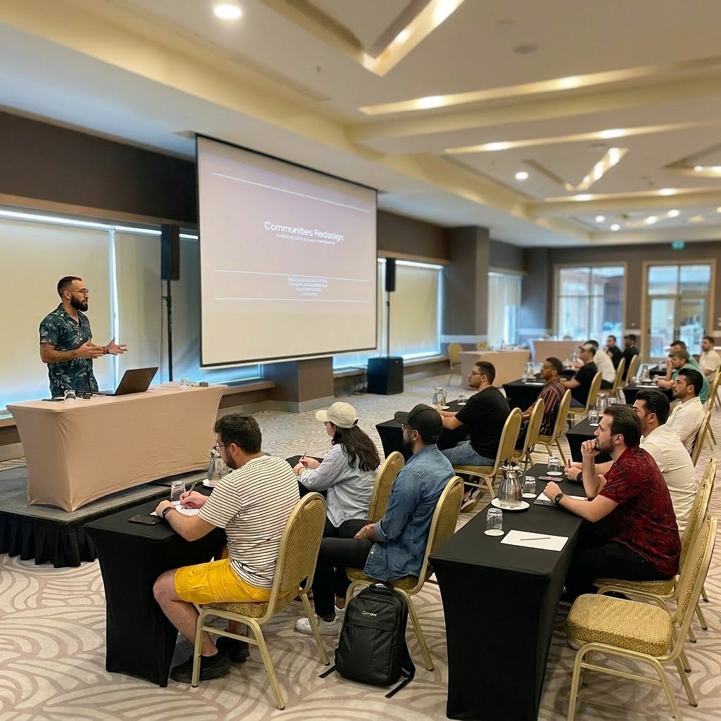
My role as Senior Product Designer:
I was the lead designer on Communities — the only designer on this product. I owned it from research through delivery.
Analysis & Research
Strategy
Design
Delivery
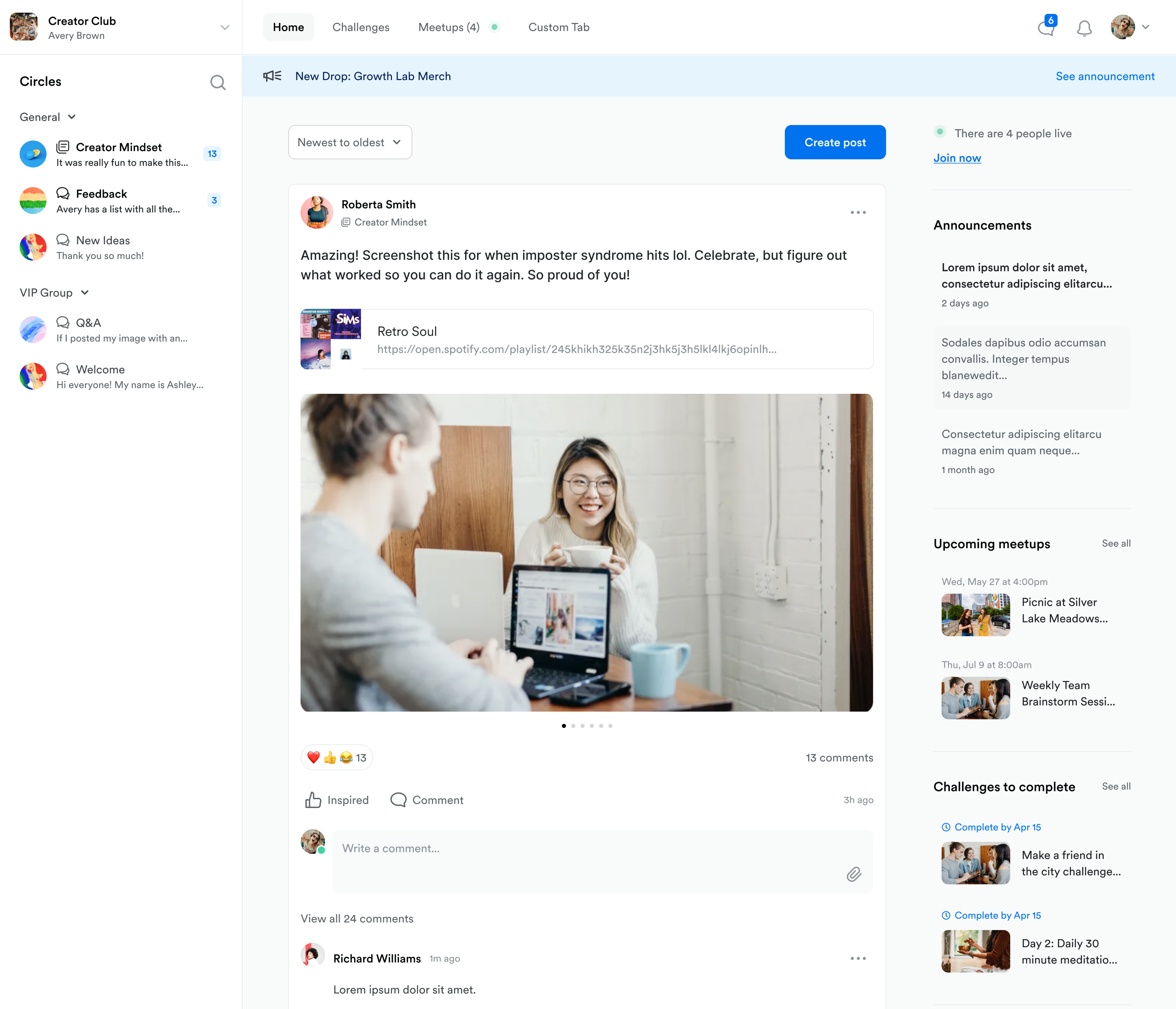
If Communities failed, Kajabi’s flywheel slowed.
Communities was Kajabi's most important surface. And most creators never touched it.
Surface for 65% of Kajabi’s DAU
17k new creators / 3k enabled
Adopters earn +8% GMV in first 30d
New creators
17.0 k
Communities enabled
3.0 k
Active communities
1.2 k
High-earning sites
+8 % GMV
Lower churn sites
Delta: -3 pp
vs non-adopters
“Communities feels confusing. I don’t know where to start.”
Creator feedback, pre-redesign
The surface diagnosis:
The product team initially framed this as UI polish.
I wasn't convinced.
The complaints were real — but I suspected the brief was wrong.
Visible complaints about UI
Brand inconsistency
Quick win opportunity
Why are creators churning?
I ran five un-moderated Maze tests to diagnose the funnel dip—and turned each insight into an actionable design decision.
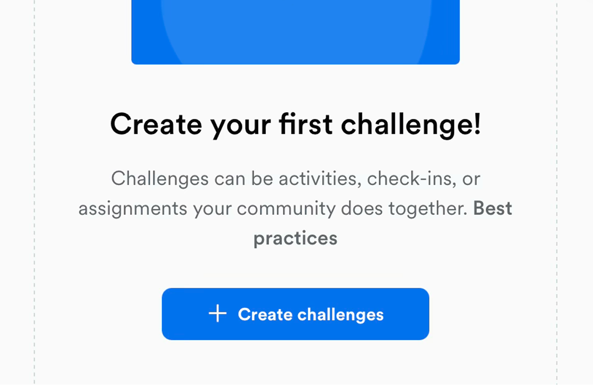
“I’m in—what now?”
New users froze at the empty feed—needed a clear next step.
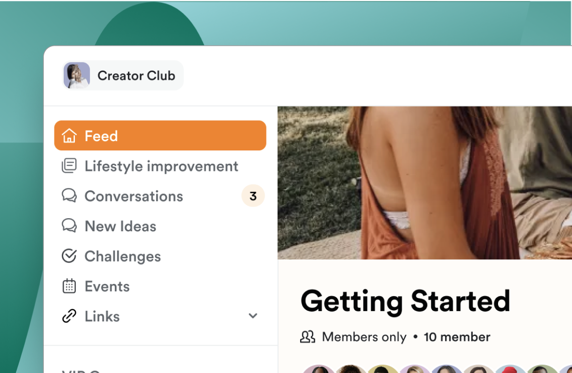
“Doesn’t reflect my brand”
Creators felt zero ownership when UI stayed generic—even a quick cover photo felt empowering.
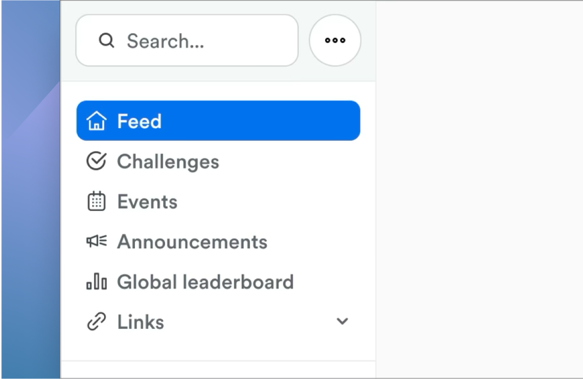
“I can’t find Live”
Top tabs scattered actions; users repeatedly asked “where is Go Live?”
Three patterns.
One diagnosis.
Activation failed before value appeared.
The PM wanted tooltips and visual cleanup.
I showed him the funnel:
17k creators, 3k ever activated.
That changed the conversation.
Constraints that shaped each design decision:
Live production
Existing communities could not break.
Legacy information architecture
Years of feature layering created structural debt.
Limited analytics visibility
Couldn’t distinguish “not used” from “not found.”
Public scrutiny
Criticism was visible and rising.
These constraints meant I couldn't fix everything at once.
I had to choose what to get right first.
Structure is expensive to change. Polish is easy to phase.
I introduced three filters to help the team and me evaluate every feature request.
Design for 0→1
Structure before surface
Teach before content
Every feature request — from tooltips to branding controls — had to pass these filters. If it didn't help a creator succeed in their first session, it waited.
Those filters led to four calls I had to defend
Unified navigation into one mental model
Designed empty states to teach, not wait
Phased customization behind confidence
Prioritized structure over polish
But things got worse before they got better...
I treated public sentiment as a product problem.
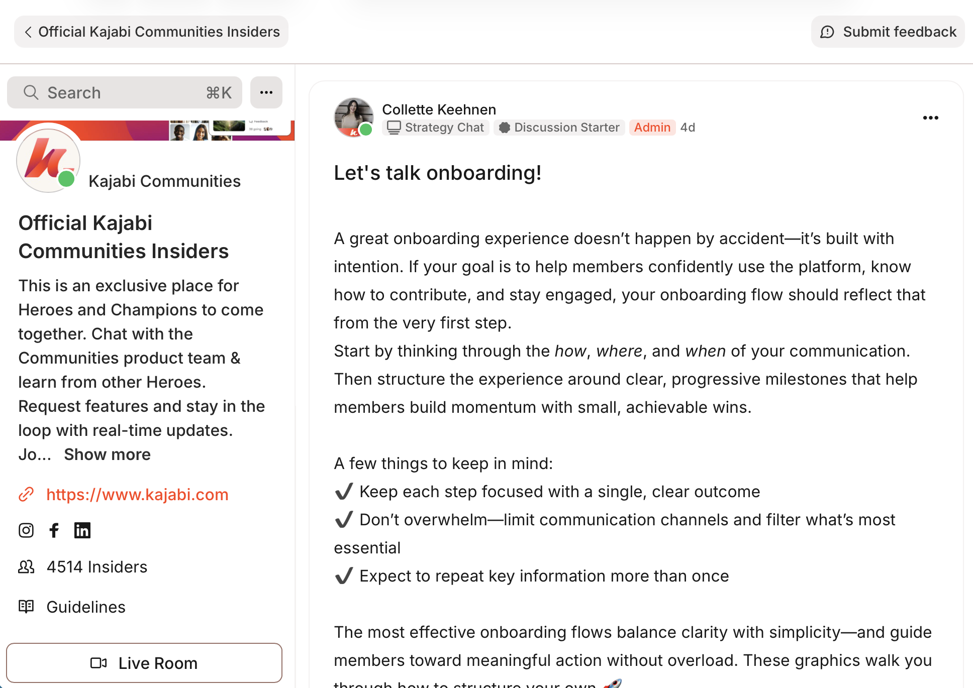
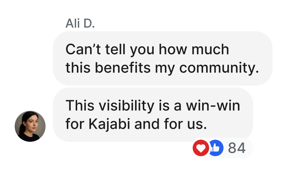
Created a private Insider Community with 50+ vocal users
Gave them priority access to share bugs and requests
Created a structured feedback loop that replaced missing product analytics
I built a research loop that gave us signal we couldn't get from analytics — and informed every structural decision that followed.
Before
Feature-rich, but directionless
Multiple entry points, no clear start.
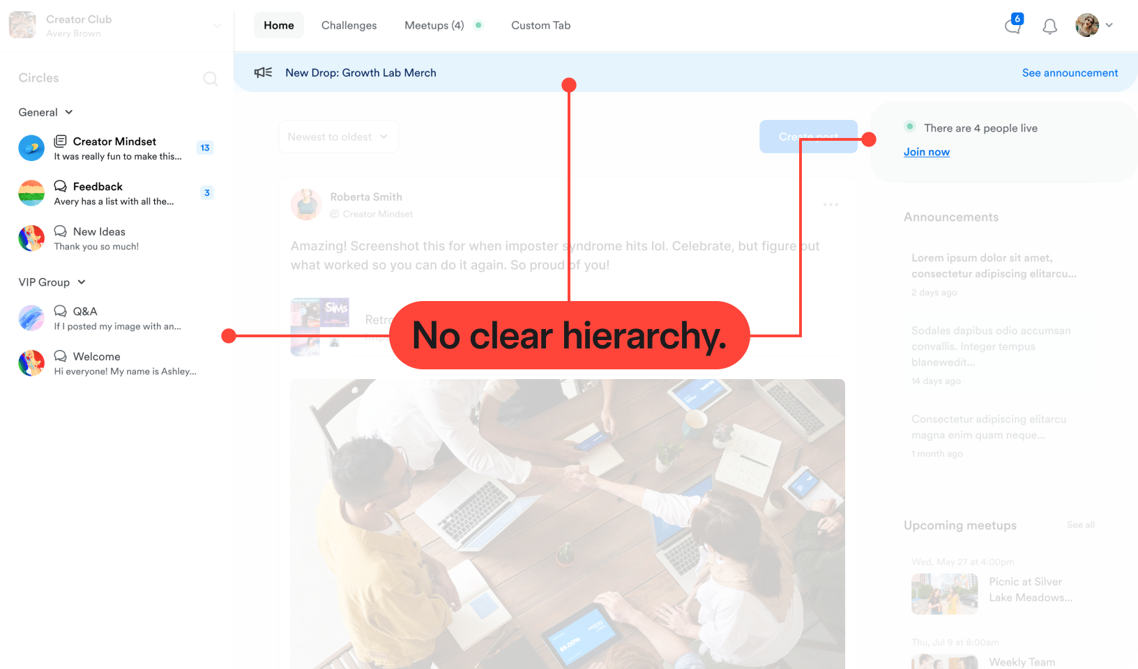
Annotations
Actions buried
Core actions hidden from first-time creators
Empty states silent
No guidance when content is missing
Generic branding
Communities felt templated, not owned
After
Guided, ownable, actionable
One clear starting point, reinforced across navigation and empty states.
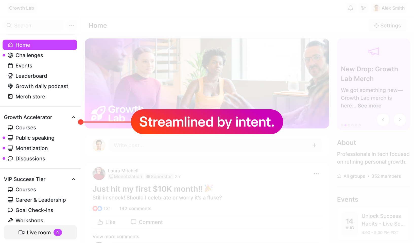
Annotations
Unified navigation
One mental model → "Structure before surface"
Clear CTAs
Guided empty states
→ "Teach before content"
Brand at surface
Ownership from first session
→ "Design for 0→1"
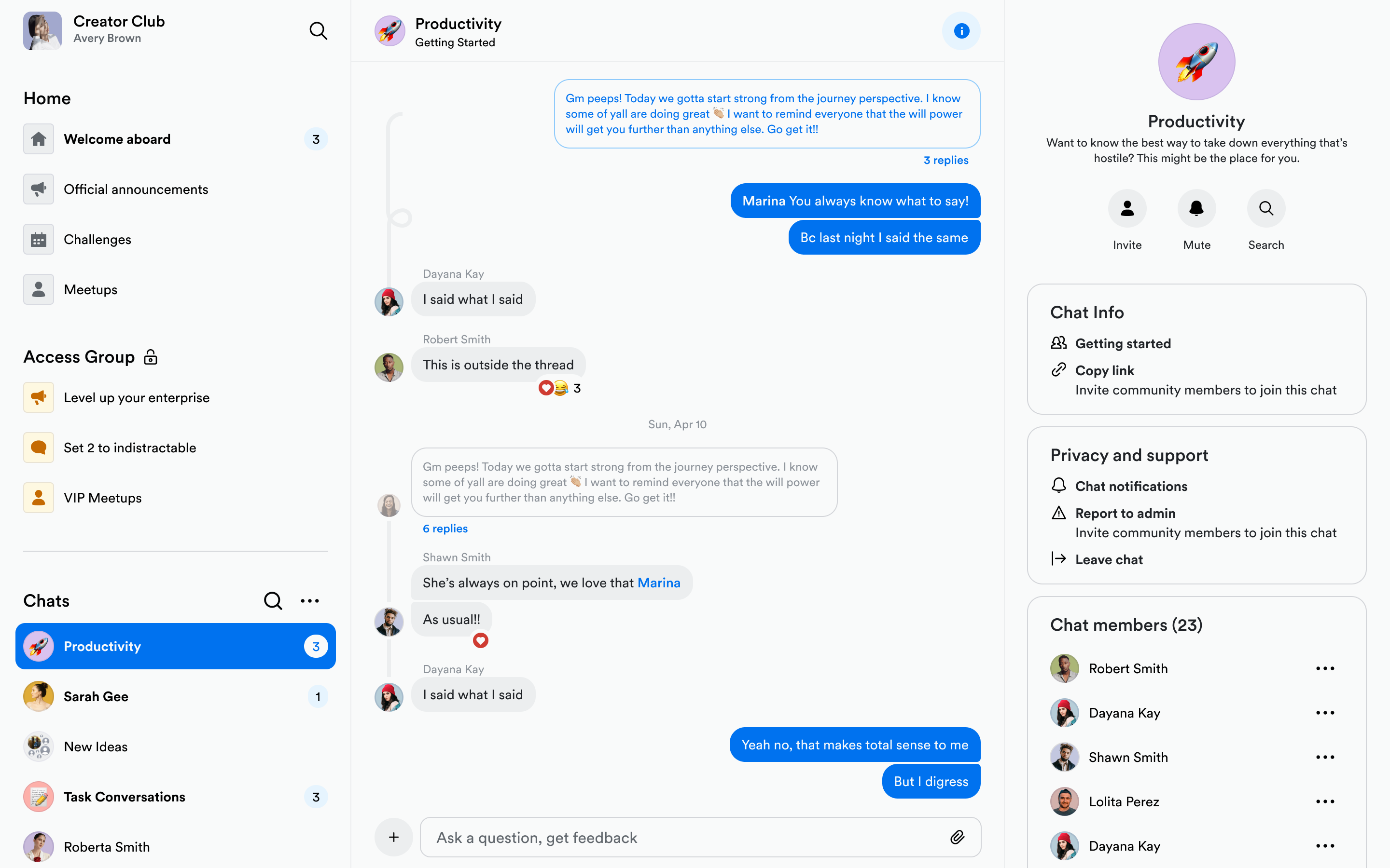
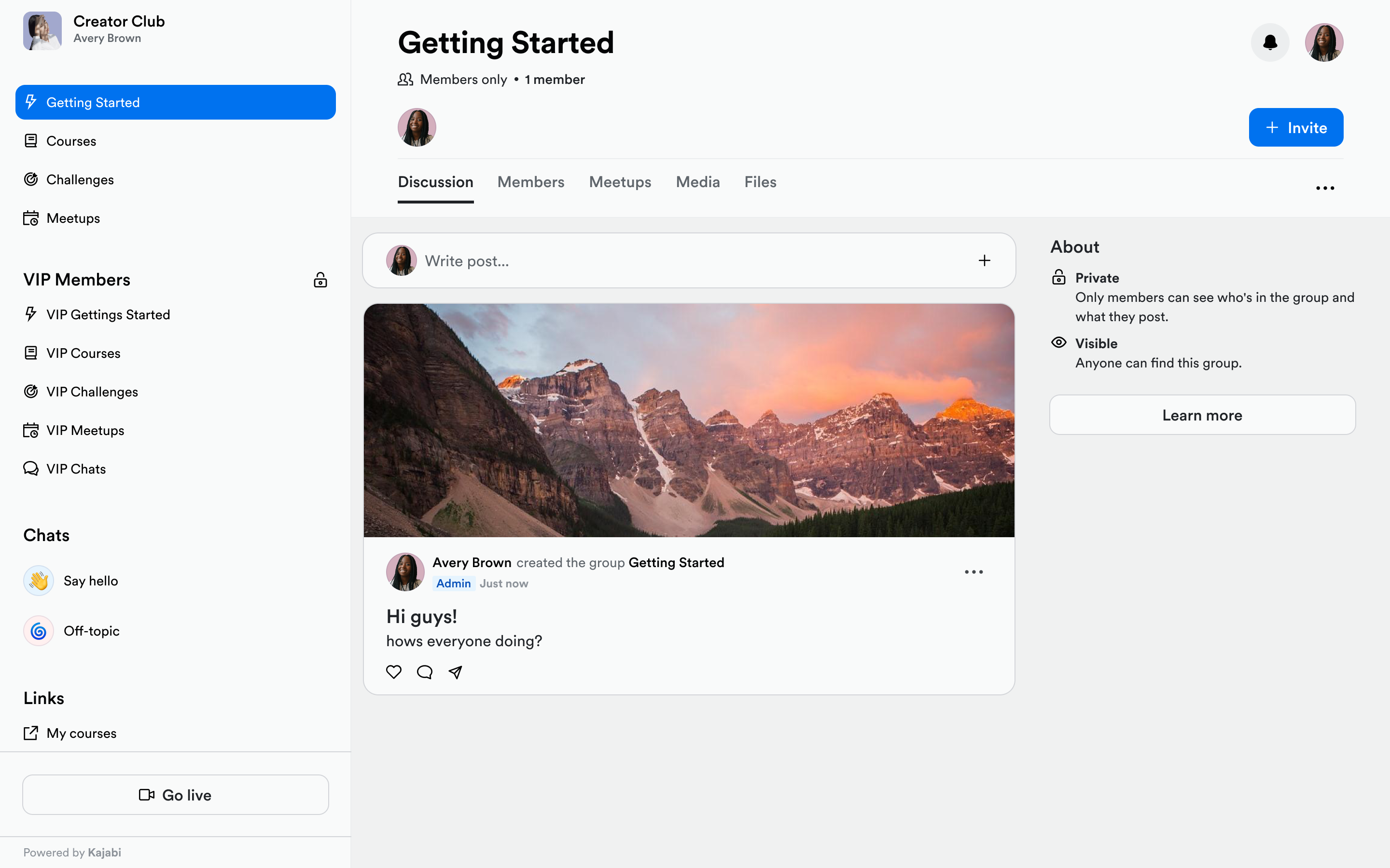
Zoom-in: Navigation
Clarity came from structure—not new features.
Final Design
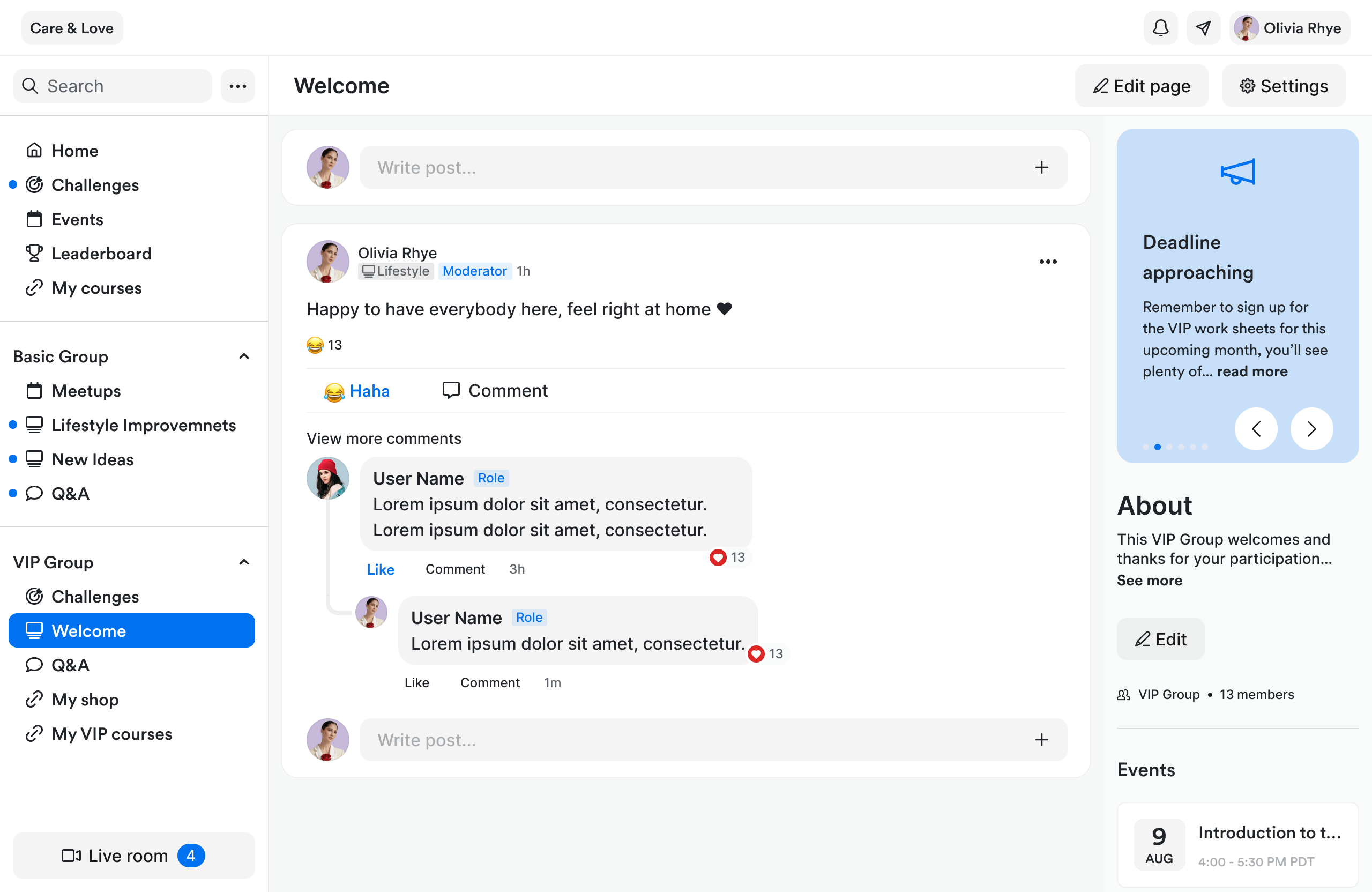
Grouped by creator intent
Live room persistent
Active state always visible
Less information, more trust
Zoom-in: Ownership at Scale
Structure earns trust. Ownership keeps creators invested.
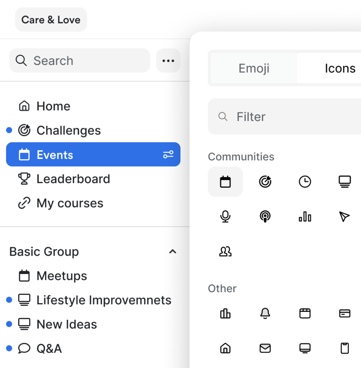
Customizable nav icons. Creators personalize each page with custom icons — reinforcing ownership and improving scannability as communities grow.
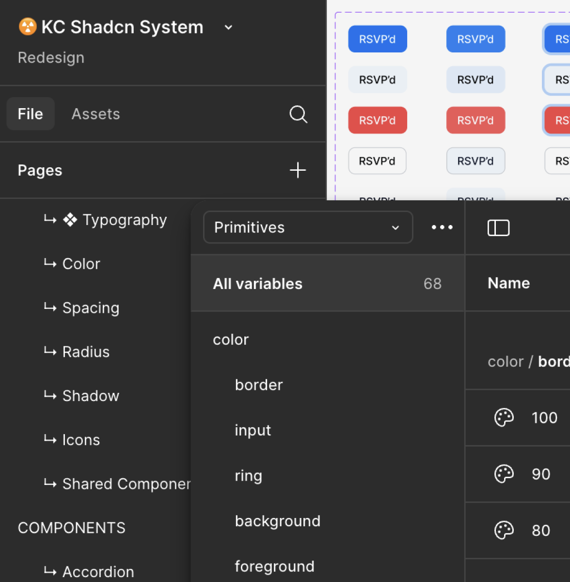
New Shadcn design system. Introduced tokens, type scale, and spacing primitives—while maintaining clear versioning and running audits.
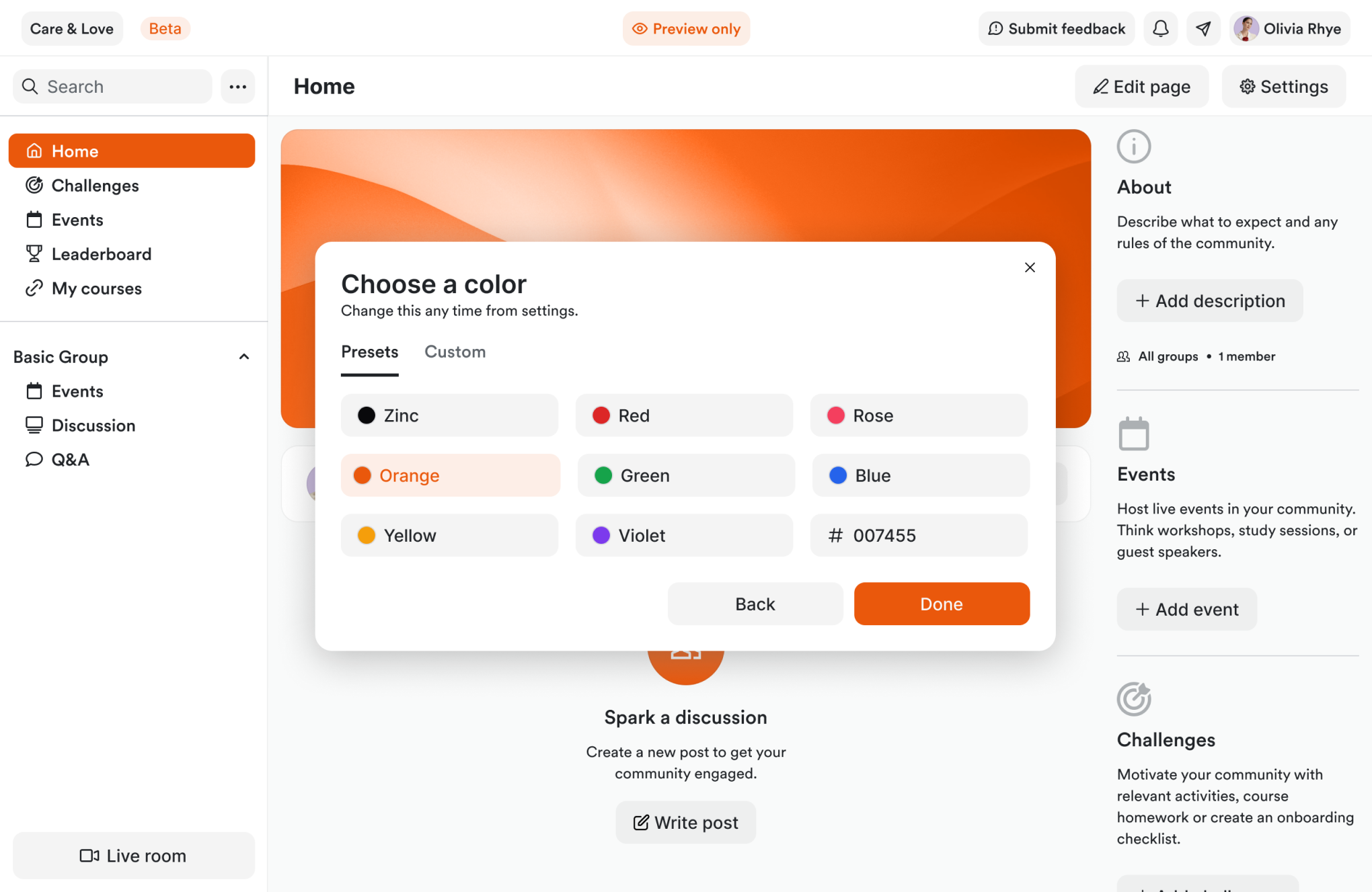
Branded cover photo. We descoped cropping tools to ship faster. Creators upload simple images to personalize pages, favoring speed over advanced customization for launch.
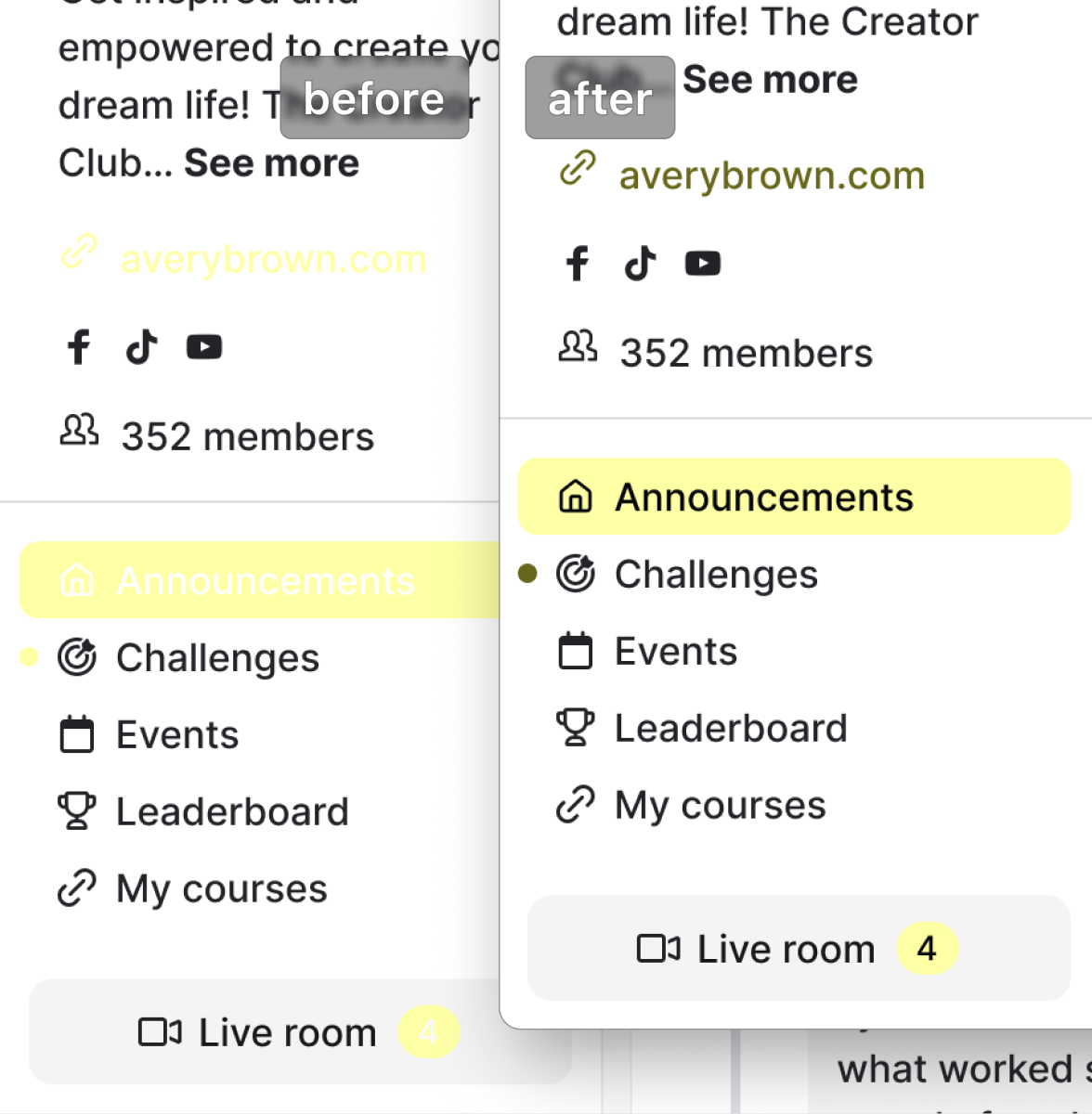
Accessible color tokens. Auto-adjusts HSL to maintain 4.5:1 contrast — creators can't accidentally break accessibility. Dark-mode ready.
A proposal that didn't ship — and an insight that did.
It addressed real behavior, but didn’t fit the system.
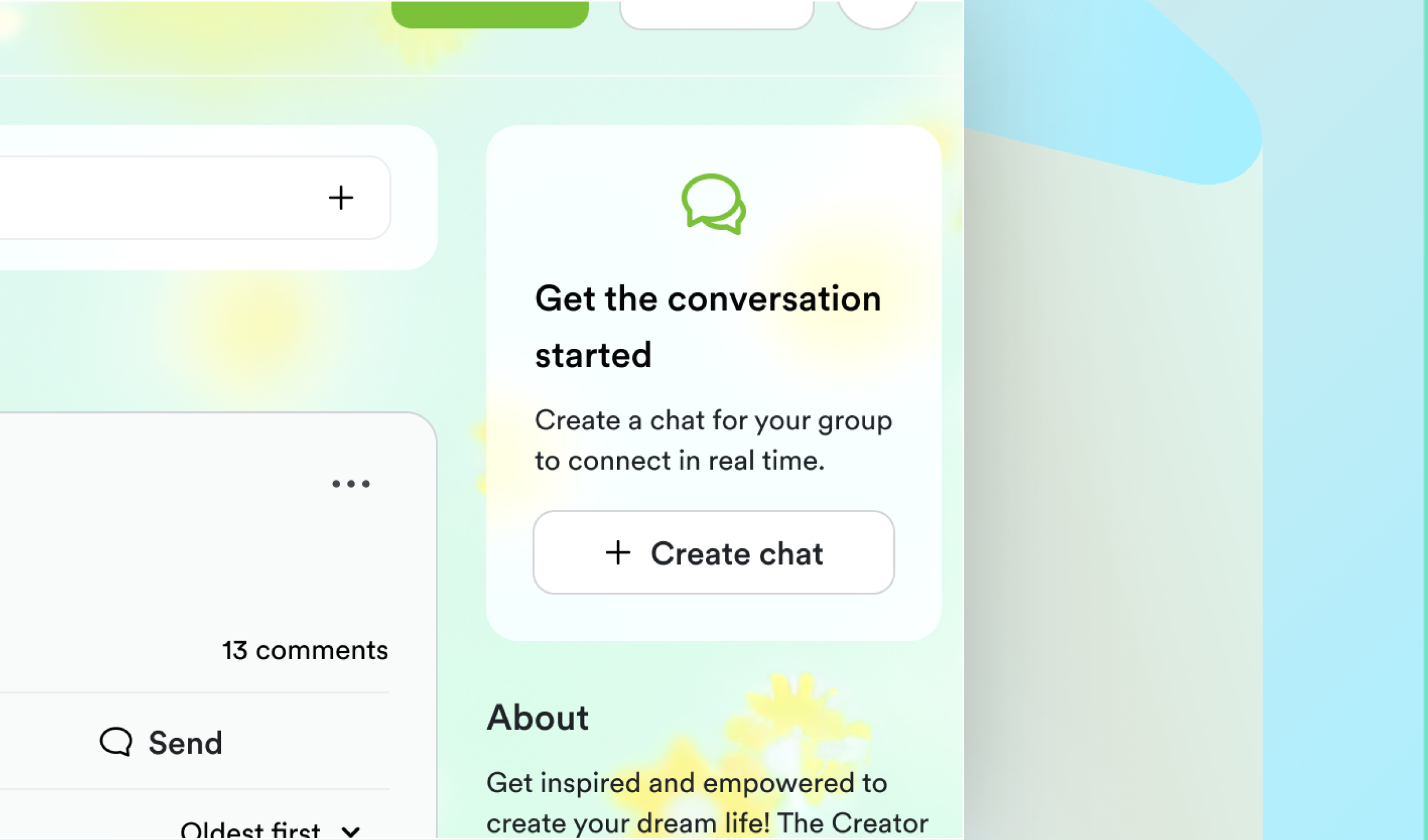
The proposal
Conversation embedded directly into feed
Why it was right
Less overhead, more relevant conversations
Why it didn’t ship
Conflicted with pricing, packaging, and scope
Design response: I carried the insight forward.
The execution changed, not the learning.
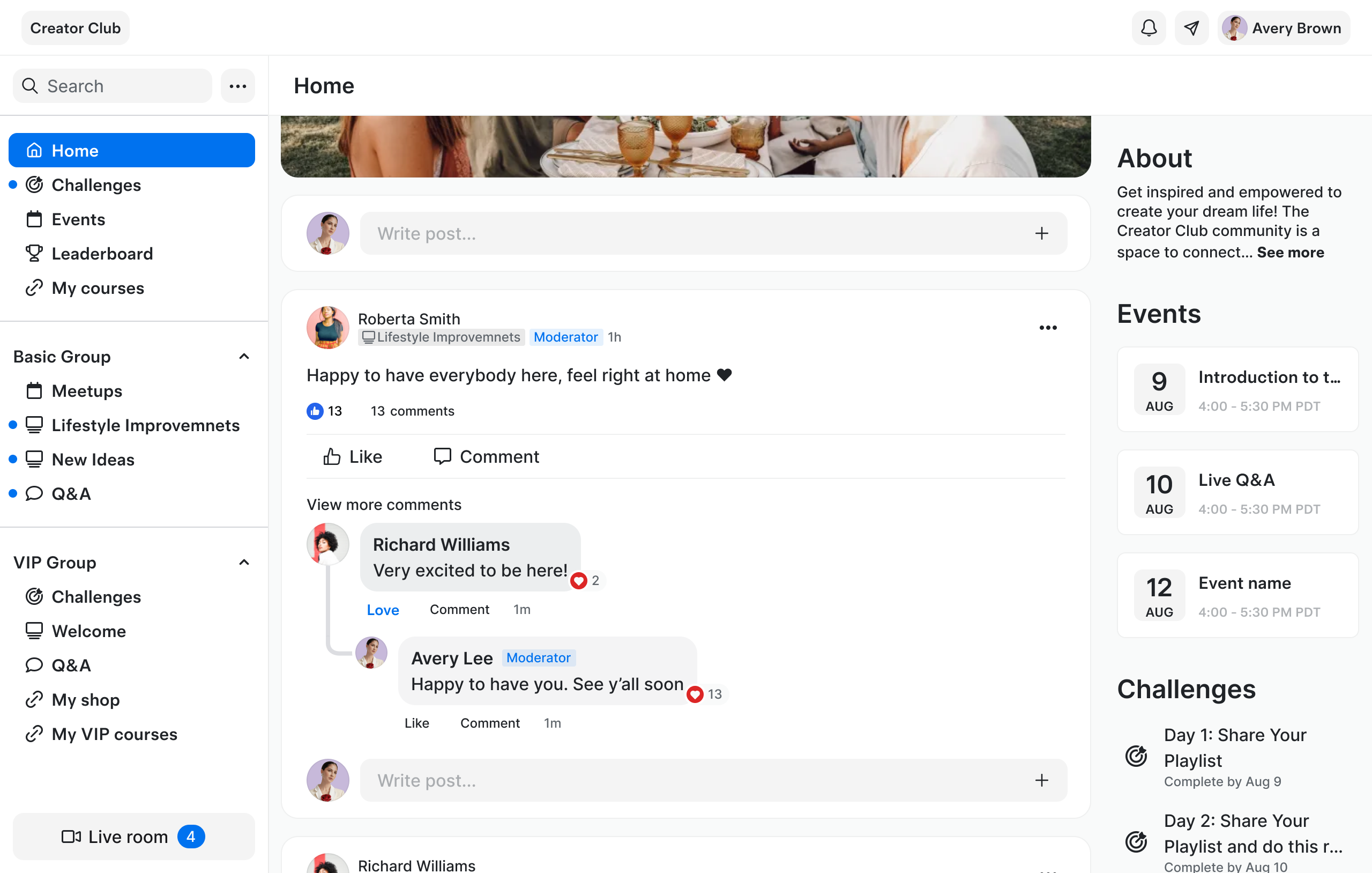
The feed became lighter. Comments and chat shared the same grammar. Creators moved between surfaces without relearning.
Conversational feed patterns
Designed comments as chat bubbles, with larger user photos and names to make feed more conversational and personal.
Mental model continuity
Creators move between feed and chat without relearning.
Measured impact
- 3 pp
Target
- 4.2 pp
Actual
30-day churn
75 %
Target
82 %
Actual
First-session post
Creators now call Communities
“the easiest way to keep subscribers engaged.”
— Creator feedback
The biggest thing this project taught me is that structure without delight is just infrastructure.
What challenged me
Listening to loud voices. Heavy reliance on qual made it hard to hear quiet, important needs.
Missing signal. No per-user analytics made it hard to separate “not used” from “not found.”
Sequencing intentionally. Fast iteration meant some creators wanted more than we gave them at launch.
What I’m taking forward
Design for delight. Layer in micro-moments—play matters, not just polish.
Track earlier. Push for individual usage analytics sooner next time.
Strengthen design-system governance. Formalize token versioning and ownership.
What I’m proud of
Scalable brand system. Introduced tokens, type, and spacing primitives that slashed dev rework and scaled across thousands of communities.
Mentorship & partnership. Mentored a junior designer through their promotion to senior.
Connect
Thank you.
Ramiro’s Portfolio
RebuildingKajabi Communities
Turning Communities into a retention engine
Ramiro Negri
|
Senior Product Designer
|
2024–2025

My role as Senior Product Designer:
I was the lead designer on Communities — the only designer on this product. I owned it from research through delivery.
Analysis & Research
Strategy
Design
Delivery

If Communities failed, Kajabi’s flywheel slowed.
Communities was Kajabi's most important surface. And most creators never touched it.
Surface for 65% of Kajabi’s DAU
Adopters earn +8% GMV in first 30d
17k new creators / 3k enabled
New creators
17.0 k
Communities enabled
3.0 k
Active communities
1.2 k
High-earning sites
+8 % GMV
Lower churn sites
Delta: -3 pp
vs non-adopters
“Communities feels confusing.I don’t know where to start.”
Creator feedback, pre-redesign
The surface diagnosis:
The product team initially framed this as UI polish.
I wasn't convinced.
The complaints were real — but I suspected the brief was wrong.
Visible complaints about UI
Brand inconsistency
Quick win opportunity
Why are creators churning?
I ran five un-moderated Maze tests to diagnose the funnel dip—and turned each insight into an actionable design decision.

“I’m in—what now?”
New users froze at the empty feed—needed a clear next step.

“Doesn’t reflect my brand”
Creators felt zero ownership when UI stayed generic—even a quick cover photo felt empowering.

“I can’t find Live”
Top tabs scattered actions; users repeatedly asked “where is Go Live?”
Three patterns.
One diagnosis.
Activation failedbefore value appeared.
The PM wanted tooltips and visual cleanup.
I showed him the funnel:
17k creators, 3k ever activated.
That changed the conversation.
Constraints that shaped each design decision:
Live production environment
Existing communities could not break.
Legacy information architecture
Years of feature layering created structural debt.
Limited analytics visibility
Couldn’t distinguish “not used” from “not found.”
Public scrutiny
Criticism was visible and rising.
These constraints meant I couldn't fix everything at once.
I had to choose what to get right first.
Structure is expensive to change.
Polish is easy to phase.
I introduced three filters to help the team and me evaluate every feature request.
Design for 0→1
Structure before surface
Teach before content
Every feature request — from tooltips to branding controls — had to pass these filters. If it didn't help a creator succeed in their first session, it waited.
Those filters led to four calls I had to defend
Unified navigation into one mental model
Designed empty states to teach, not wait
Phased customization behind confidence
Prioritized structure over polish
But things got worsebefore they got better...
I treated public sentiment as a product problem.


Created a private Insider Community with 50+ vocal users
Gave them priority access to share bugs and requests
Created a structured feedback loop that replaced missing product analytics
I built a research loop that gave us signal we couldn't get from analytics — and informed every structural decision that followed.
Before
Feature-rich, but directionless
Multiple entry points, no clear start.

Annotations
Actions buried
Core actions hidden from first-time creators
Empty states silent
No guidance when content was missing
Generic branding
Communities felt templated, not owned
After
Guided, ownable, actionable
One clear starting point, reinforced across navigation and empty states.

Annotations
Unified navigation
One mental model
→ "Structure before surface"
Clear CTAs
Guided empty states
→ "Teach before content"
Brand at surface
Ownership from first session
→ "Design for 0→1"
Zoom-in: Navigation
Clarity came from structure—not new features.
Iteration A
Minimal disruption — moved features left, kept existing IA
Trade-off
Feature-driven structure didn't match how creators think
Iteration B
Embedded features inside channels — richer but complex
Trade-off
Conflicted with pricing, too complex for day zero
Final Design

Less information, more trust
Live room persistent
Active state always visible
Grouped by creator intent
Zoom-in: Ownership at Scale
Structure earns trust. Ownership keeps creators invested.

Customizable nav icons. Creators personalize each page with custom icons — reinforcing ownership and improving scannability as communities grow.

New Shadcn design system. Introduced tokens, type scale, and spacing primitives—while maintaining clear versioning and running audits.

Branded cover photo. We descoped cropping tools to ship faster. Creators upload simple images to personalize pages, favoring speed over advanced customization for launch.

Accessible color tokens. Auto-adjusts HSL to maintain 4.5:1 contrast — creators can't accidentally break accessibility. Dark-mode ready.
A proposal that didn't ship — and an insight that did.
It addressed real behavior, but didn’t fit the system.

The proposal
Conversation embedded directly into feed
Why it was right
Less overhead, more relevant conversations
Why it didn’t ship
Conflicted with pricing, packaging, and scope
Design response: I carried the insight forward.
The execution changed, not the learning.

The feed became lighter. Comments and chat shared the same grammar. Creators moved between surfaces without relearning.
Conversational feed patterns
Redesigned comments as chat-style bubbles with prominent user photos — the same visual grammar used in Chat. Feed and Chat now share one interaction language.
Mental model continuity
Creators move between feed and chat without relearning.
Measured impact
- 3 pp
Target
- 4.2 pp
Actual
30-day churn
75 %
Target
82 %
Actual
First-session post
Creators now call Communities
“the easiest way to keep subscribers engaged.”
— Creator feedback
The biggest thing this project taught me is that structure without delight is just infrastructure.
What challenged me
Listening to loud voices. Heavy reliance on qual made it hard to hear quiet, important needs.
Missing signal. No per-user analytics made it hard to separate “not used” from “not found.”
Sequencing intentionally. Fast iteration meant some creators wanted more than we gave them at launch.
What I’m taking forward
Design for delight. Layer in micro-moments—play matters, not just polish.
Track earlier. Push for individual usage analytics sooner next time.
Strengthen design-system governance. Formalize token versioning and ownership.
What I’m proud of
Scalable brand system. Introduced tokens, type, and spacing primitives that slashed dev rework and scaled across thousands of communities.
Mentorship & partnership. Mentored a junior designer through their promotion to senior.
Connect
Thank you.